
Site content: slider, services, projects, and gallery
Every section of the home page has its own screen for managing its content, and they all work the same way: a heading in Arabic and English, a description, an image, an order, and an enable switch.
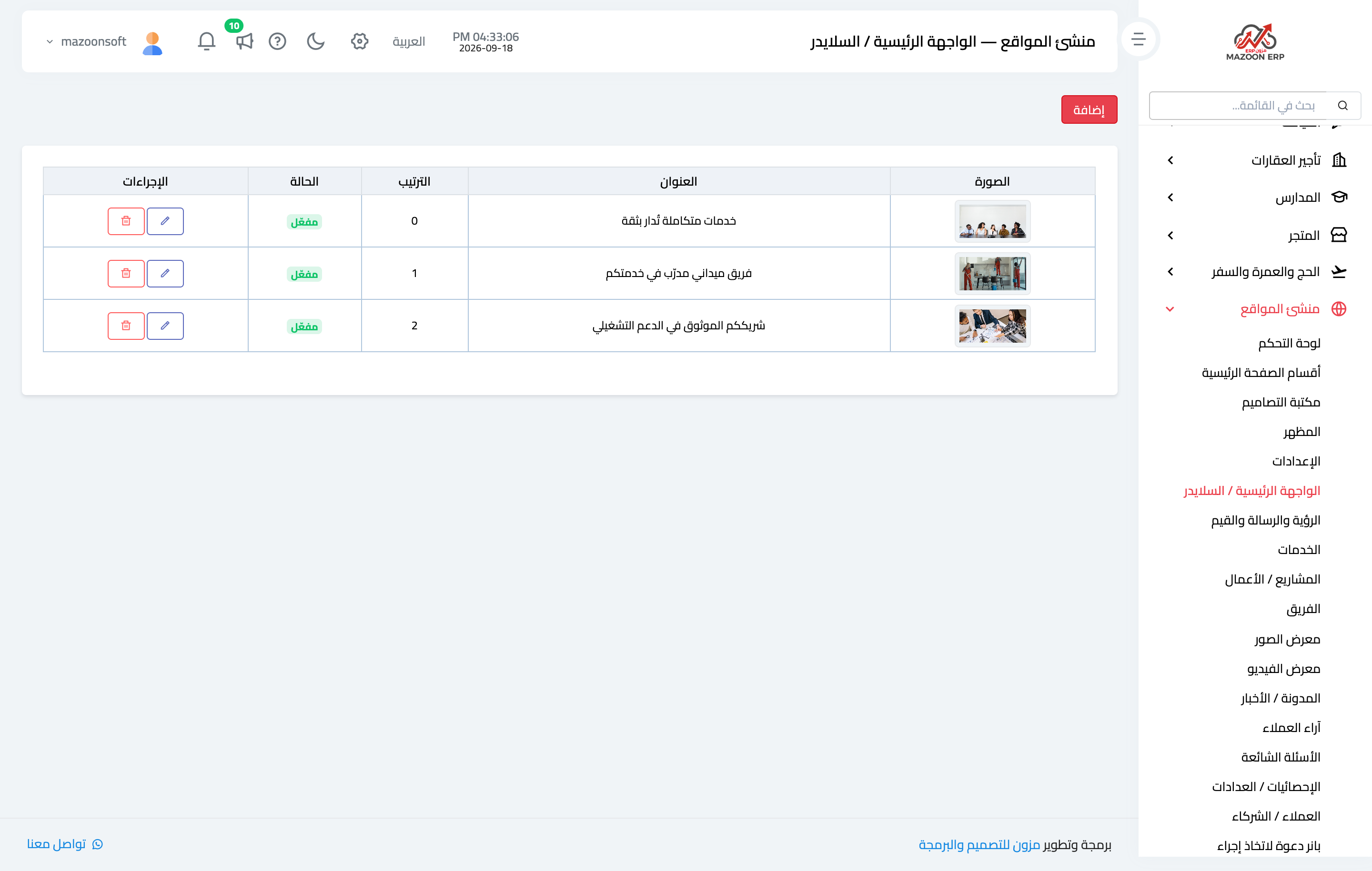
The hero slider
This is the first thing a visitor sees — Figure 1. Each slide has a background image, a main heading, a sub-line, and a call-to-action button.
Three slides are enough; anything beyond that the visitor never reaches.
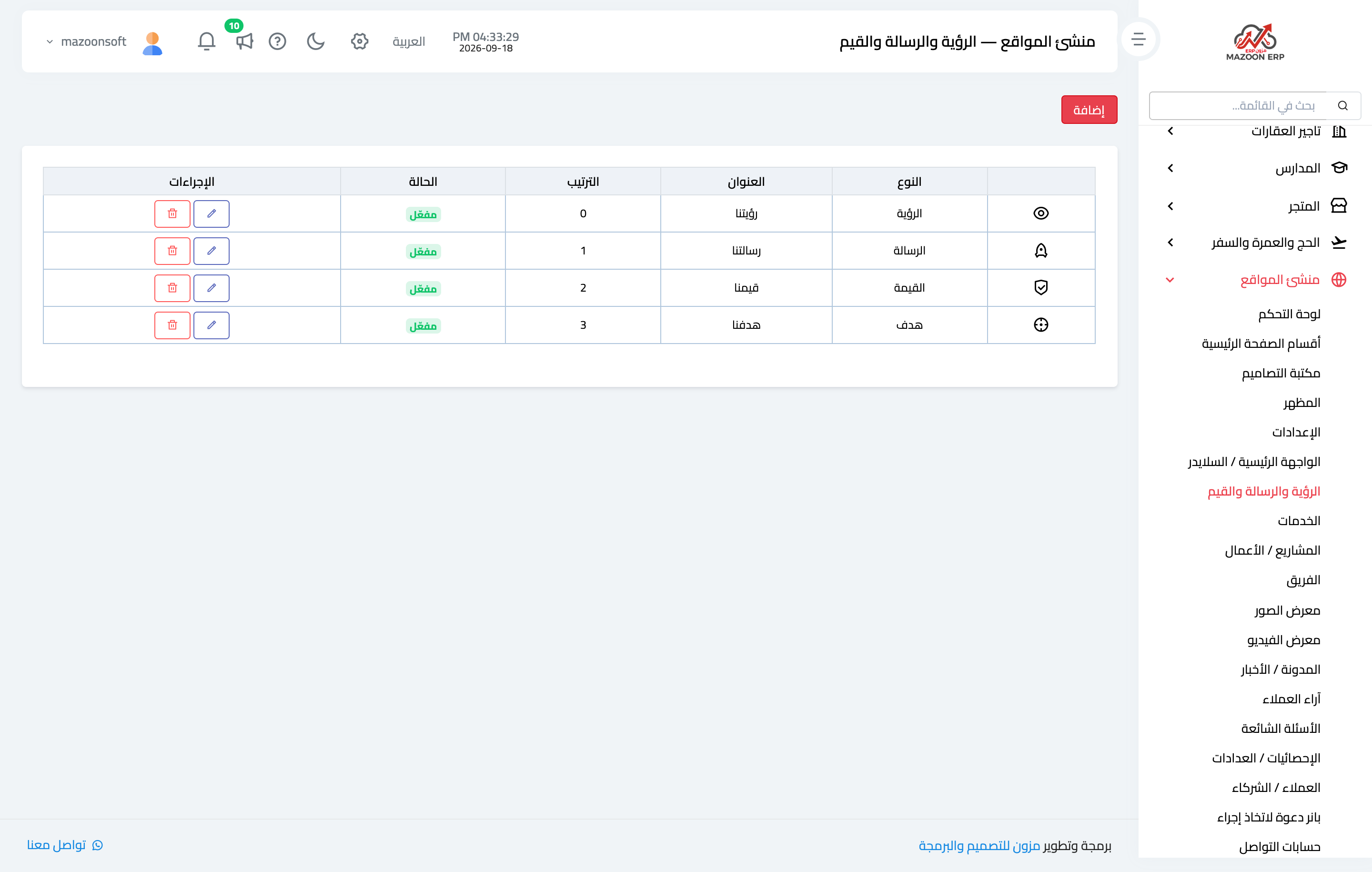
Vision, mission, and values
Short cards — Figure 2 — each with an icon, a heading, and a brief text. This is the right place to say who you are and why a client should choose you.
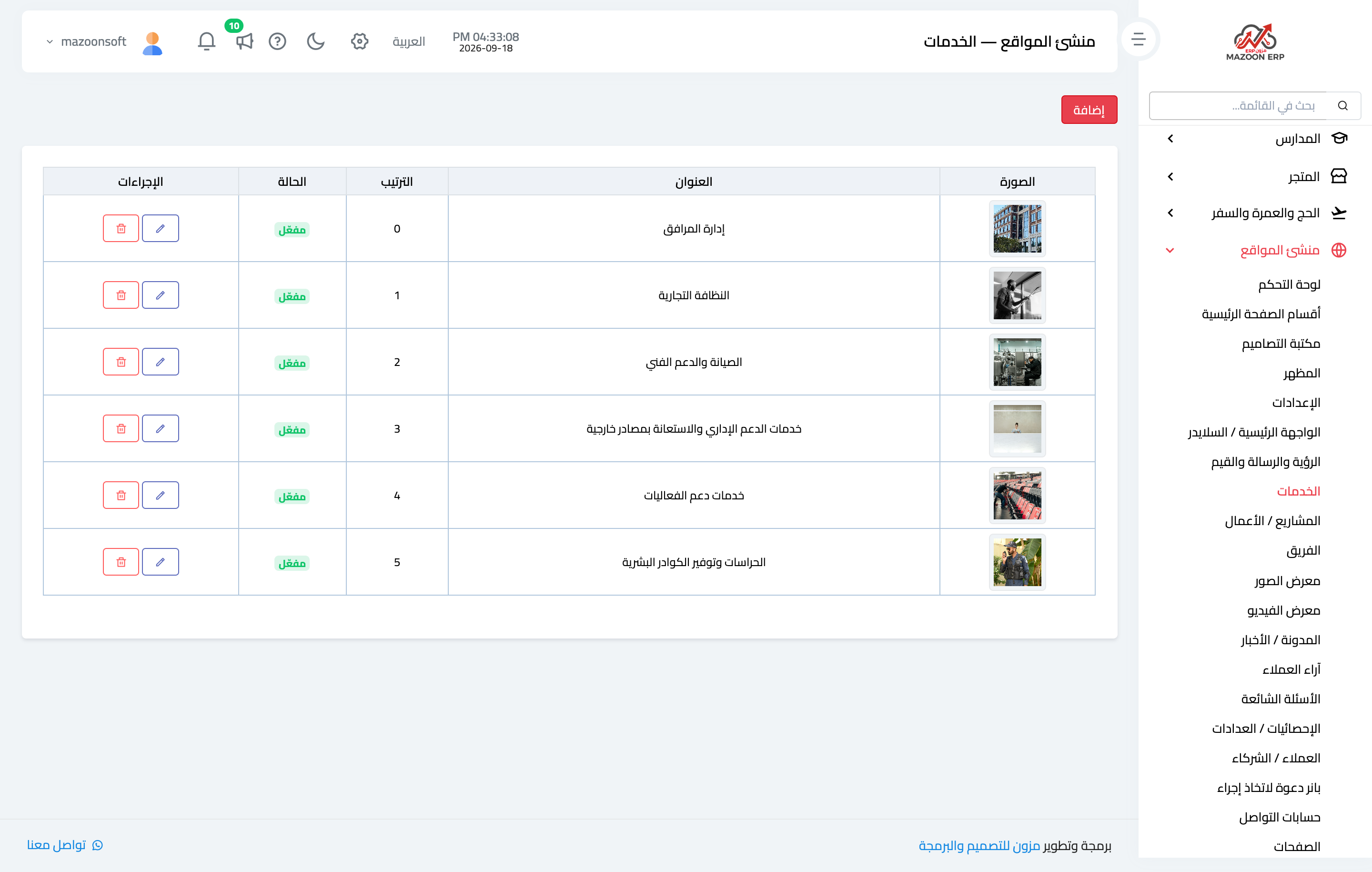
Services
The heart of a company site — Figure 3. Each service has a title, a description, a main image, and an order, and its own page carrying extra media — images and video clips.
The order here is not cosmetic: put the service you most want to sell at the top of the list.
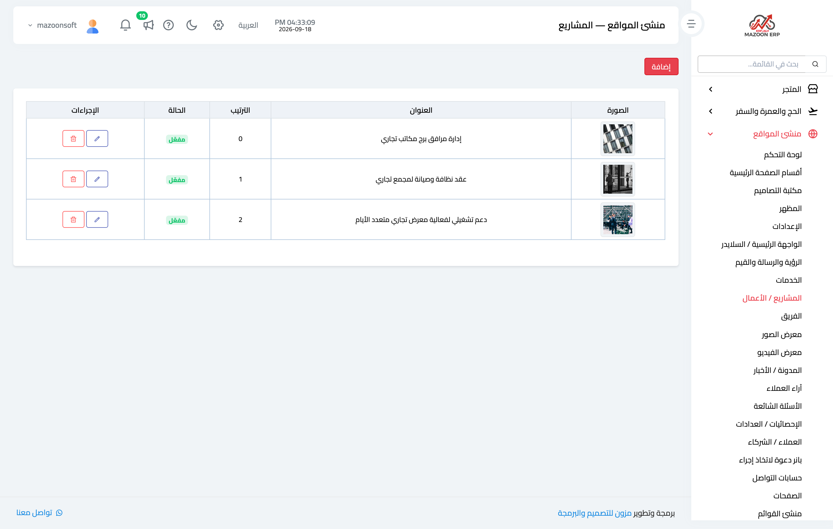
Projects / Our work
Your portfolio — Figure 4 — and the strongest evidence you hold in front of a client who has never worked with you. Each project has a detail page with its own media.
Photo and video gallery
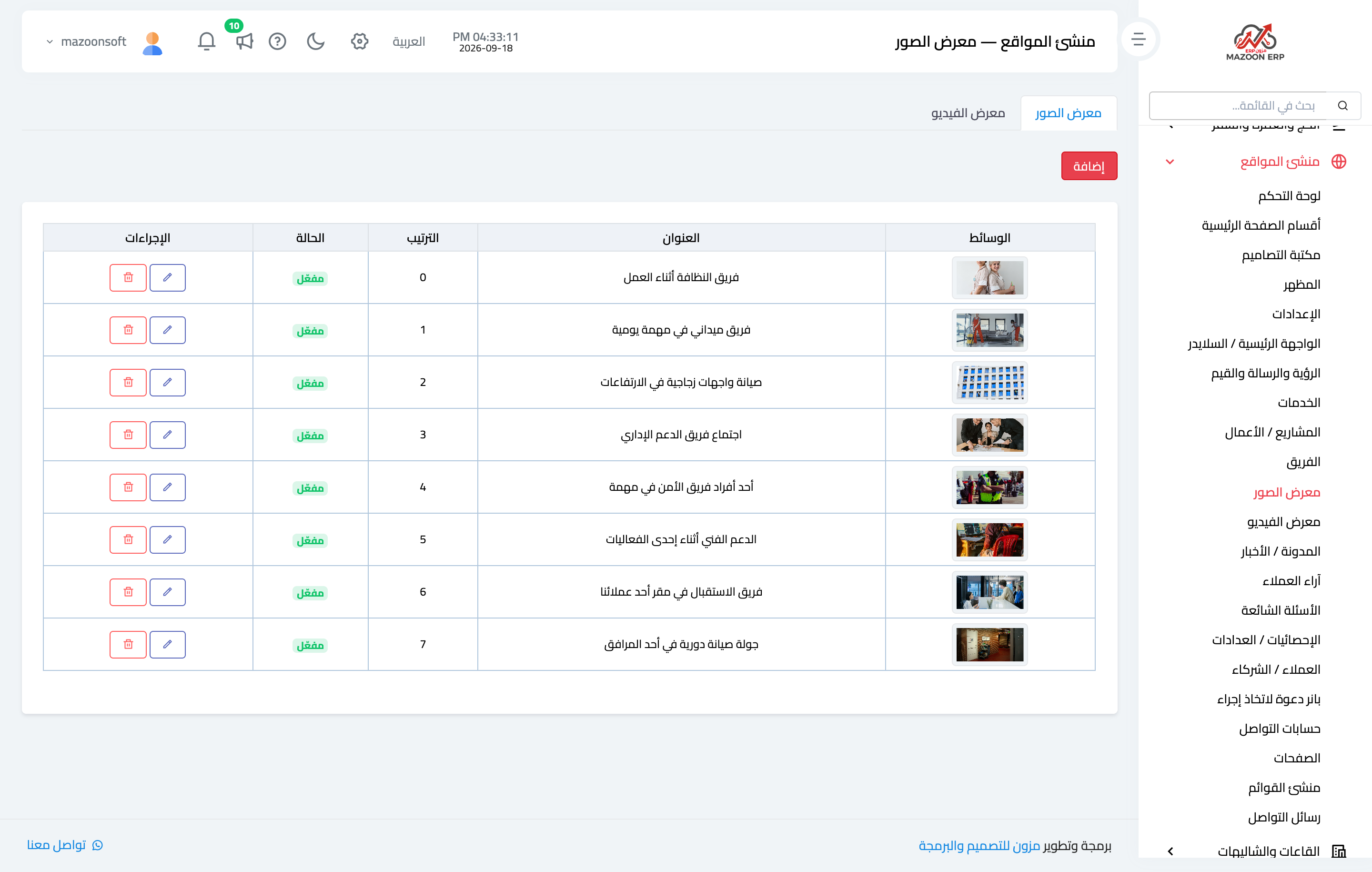
One screen with two tabs — Figure 5: the photo gallery for field photographs, and the video gallery for YouTube links and uploaded clips.
The caption under each image matters: it tells the visitor what they are looking at, and it is what the search engine reads.
Team
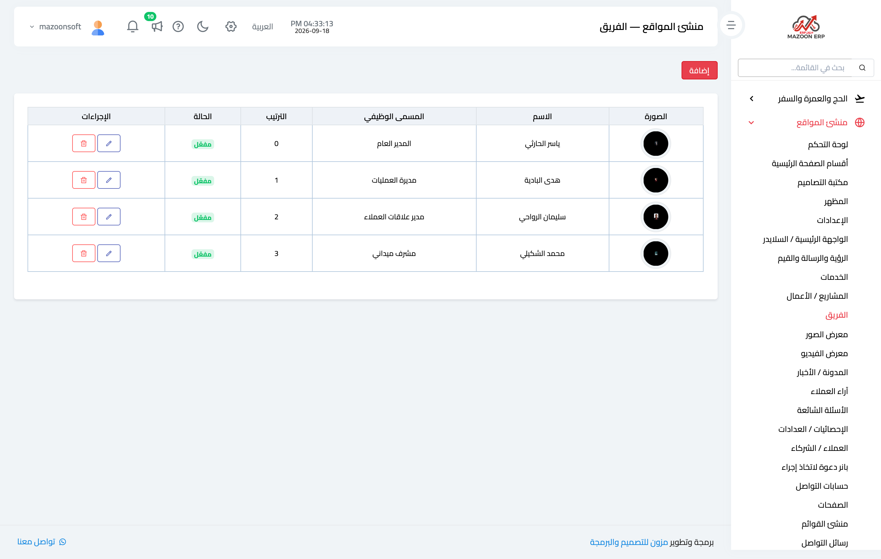
The team members’ names, titles, and photos — Figure 6 — with an optional bio and contact links for each one.
Testimonials
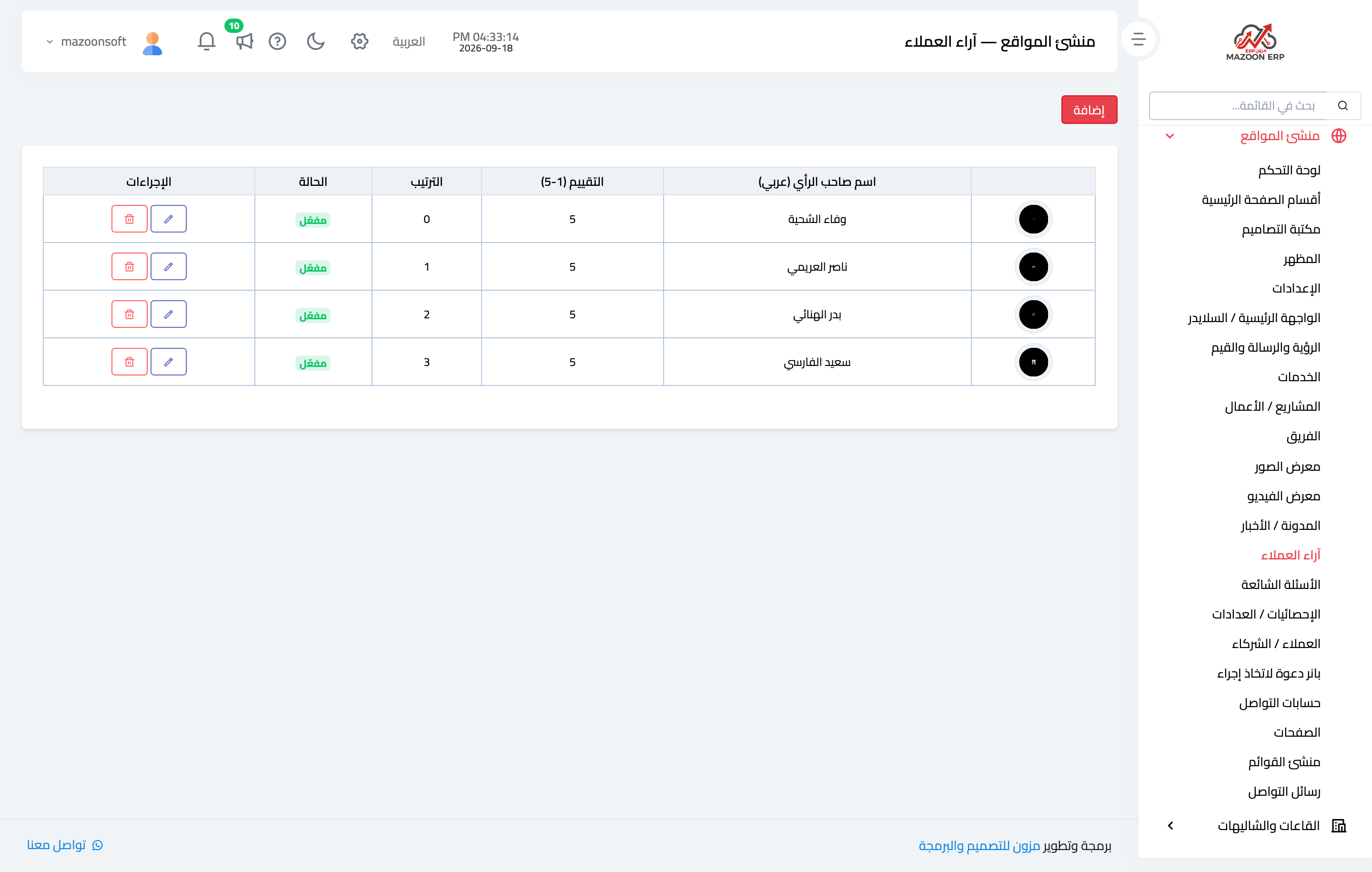
Written testimonials with the author’s name, organisation, and rating — Figure 7. A short, specific testimonial carries more weight than a long general paragraph.
FAQs
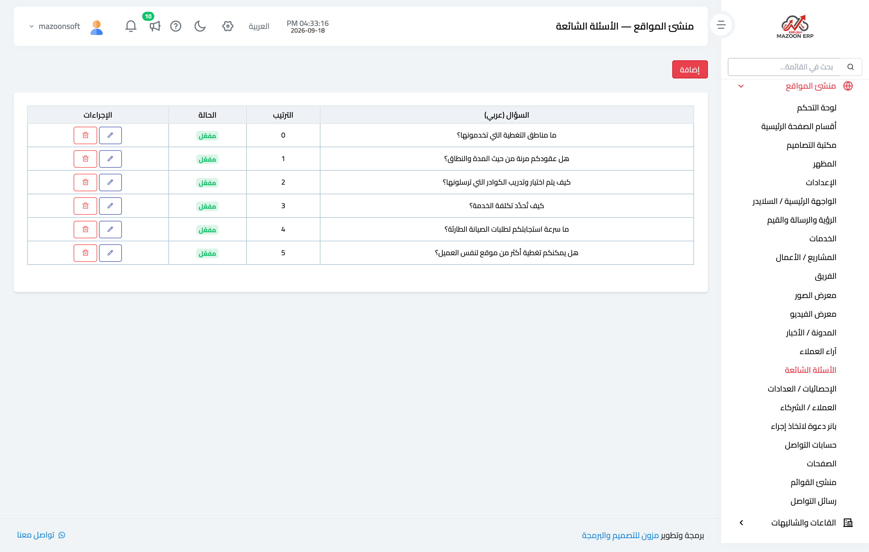
A question-and-answer list — Figure 8 — the least glamorous section and the one that saves you the most time: put in it every question that keeps coming back on the phone.
Stats and clients
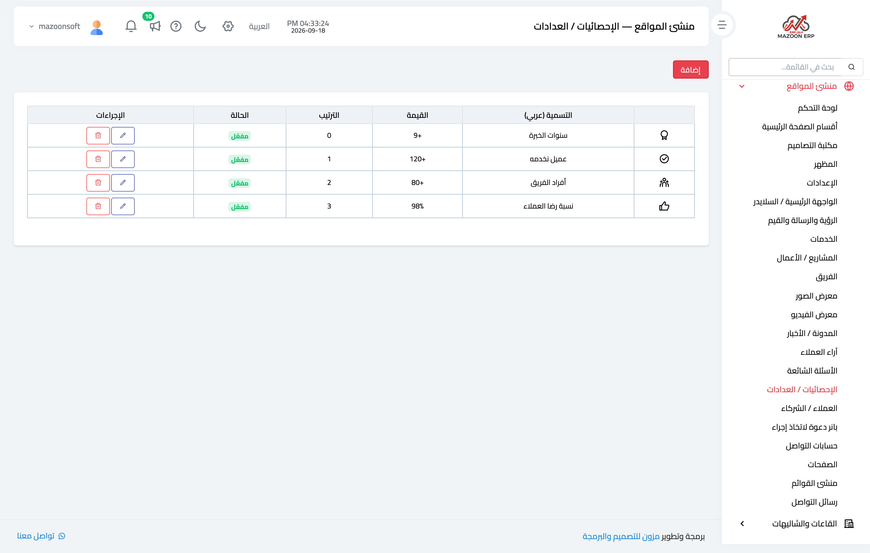
Stats / counters — Figure 9 — a handful of numbers that sum up your experience: years in business, number of clients, satisfaction rate.
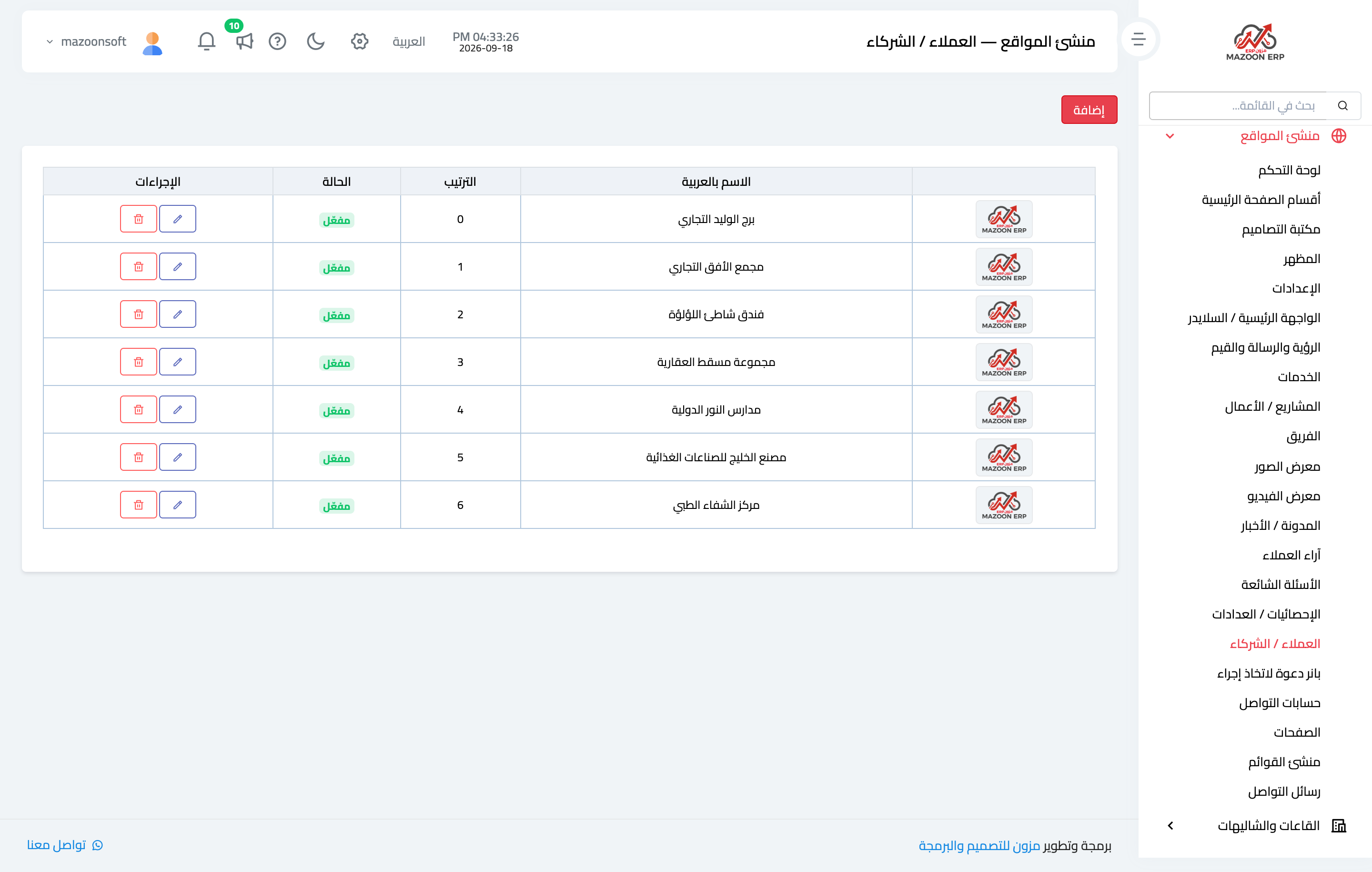
Clients / partners — Figure 10 — the logos of those you have worked with. Never put up an organisation’s logo without its permission.
Notes
- Write every heading in both languages; a blank field shows up blank to a visitor on the other version.
- Keep the image size consistent within a section; mismatched sizes are the most visible thing that spoils a page.
- Disable any section you have no real content for rather than leaving it on starter content.
- Set how many items appear on the home page from the sections screen; the rest show on the section’s own full page.
Screenshots
Try what you just read on your own data
Open a free 7-day trial — no credit card, with your own company link in minutes.