
How do I read the dashboard cards, and why do their figures differ?
Five cards at the top of the dashboard look alike, but each answers a different question. Confusing them is what trips up new users most, which is why each card carries a small line explaining the basis of its figure.
Steps
- Open Home — image 1 — and pick the period with the this month and this year buttons at the top.
- Revenue: everything you billed in the period from approved invoices, not what you collected in cash.
- Expenses: approved expenses and purchases in the same period.
- Net profit: revenue minus expenses as per the two cards above.
- Outstanding receivables: an accumulated unpaid balance for everything still unsettled to date, not only what belongs to the chosen period — which is why it does not change when you switch the month.
- Cash collected: money actually received, by the payment voucher's own date, which is the figure that reflects the cash that reached your till.
- Below the cards a chart compares revenue with expenses over recent months, and beside it a quick access panel with buttons opening the modules, the my subscription screen and the introductory video.
Notes
- The gap between revenue and cash collected is the gap between accrual and cash: an invoice approved today and not yet paid counts in the first and not in the second. Two figures far apart is a collections signal, not a system error.
- The percentage under each card compares the current period with the preceding period of the same length.
- Draft and cancelled invoices count in none of these figures; approval is what brings an invoice into the calculation.
- The dashboard is a quick summary, not a substitute for the reports: for detail, filtering and export go back to the accounting and sales reports.
Screenshots
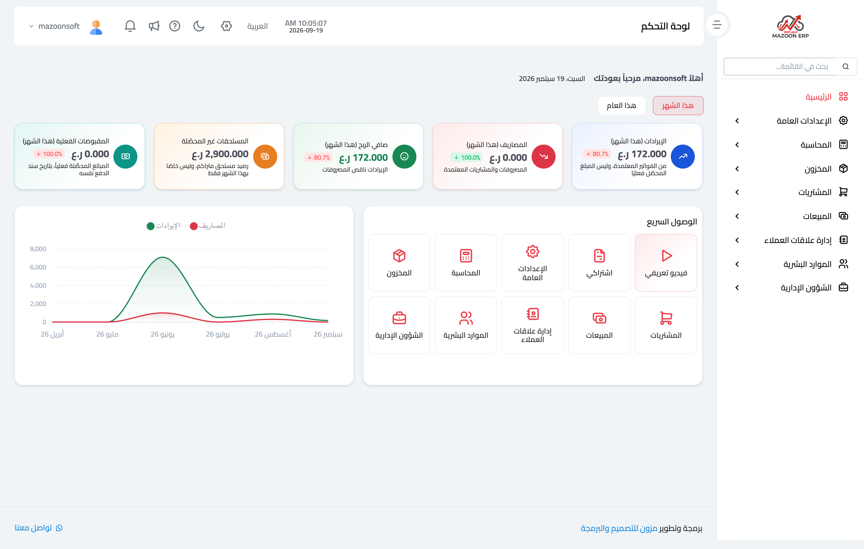
Figure 1
Try what you just read on your own data
Open a free 7-day trial — no credit card, with your own company link in minutes.